Cluster – Zuckerzeit

Ugh this is so gorgeous. Even thought it kind of looks like it says Fuckerreit (Fuck 'er, right?). Most experimental indie airbrush style artwork can be traced back to this. I don't even know what it sounds like, the cover is just too gorgeous. What if it's some late period album where they tried to make a radio hit (its Cluser, they would never do that). There's so much love put into the title that I forget that the bottom half of the album has absolutely nothing on it.
James Gang – James Gang Rides Again

In the 70s, there was a wave of boogie woogie albums with stark, severe covers that were not a good indicator of the music inside. Edgar Winter Group were another offender, especially the obscure, bizarre cover to their album with Rick Derringer. The thick, black, tightly kerned text on Rides Again seems more appropriate for a modern techno record than from a guy who'd eventually join The Eagles. Their later album Miami uses a similar design but with the colors reversed. It's a little more clever, with the back of the cover just being the front reversed, but black text on white just seems a bit braver to me. Or lazier, I'm not sure.

Despite this, I love the type on this cover. The tight kerning, the perfect leading (in the biz we call this the "lock up", when the letters are adjusted to fit together in a pleasing way). This cover always stood out to me while browsing the CD racks in high school, though its best presentation is on a battered, off-white vinyl copy with a noticeable ring from the disc.
Richard And Linda Thompson – I Want To See The Bright Lights Tonight

There's such a desperation in this cover. The sweaty condensation on the window, the hand-drawn letters. It looks intense and passionate. I wonder how many tries it took to get this just right? The lighting is perfect, the letters are all about the same size, mostly centered: this took dedication. That's not even including the work that went into figuring out the correct film speed and exposure. I find a lot of value is seeing the work that goes into a piece.
The Sex Pistols - Never Mind the Bollocks

Punk is fashion, fashion is branding, and Malcolm McLaren knew how to do branding. Considering the lo-fi, grainy photo collage style of the punk and hardcore I grew up with, this cover looks a little bit too clean, but it's so iconic. It takes a closer look to see how the letters up top aren't lined up exactly, this was done with an Xacto knife and glue, you can see the history of paste-up lettering in the pre-digital age. It's got the extreme letter size difference with "Here's the" that harkens back to old time broadsheet newsprints, and the hot pink that presages New Wave. The variances in color offset printing mean those yellows and pinks differ dramatically depending on the edition, which to me is just another way the piece grows and shows history.
Lee Morgan - The Rumproller

If any designers work was a labor of love, Reid Miles covers for Blue Note fit that description exactly. The jazz label paid a pittance, but the limitations (mostly typography, maybe a picture of the artist) gave rise to some of the most enduring covers in modern history, still continually the subject of homage, and (more frequently) rip offs. The Rumproller is just one of many Miles did that were based on a single typographical concept, but definitely the trippiest. I'm not sure how he did it, presumably he printed the text on a piece of transparent plastic (like the kind used on an overhead projector), then manipulated it over a piece of photographic paper in a darkroom, then tracing the results. In any case, it's a genius solution that influenced my own experiments in manipulating existing typefaces.
Daft Punk - Discovery
Alan Parsons - The Very Best (Live)

It's hard to see in smaller versions, but the rainbow gradient on the bevel of the letters really elevates this piece. Daft Punk had such an iconic visual style that's its kind of funny that the majority of their albums have type-only covers. They acted like a subtle calling card, reigning in their visual style so their maximalist live show would hit even harder.
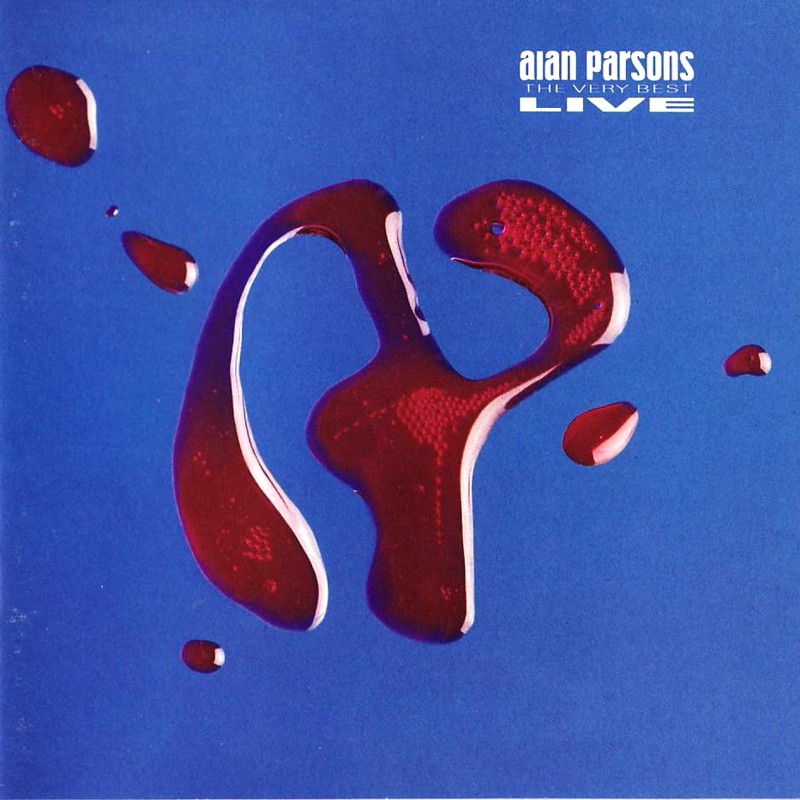
I'm not sure if the Discovery cover was digital or handmade, but this cover by Hipgnosis was all done in-camera. The photographer tasked to create it had their work cut out for them: getting liquid to congeal into a new version of the Alan Parsons logo, while bent over a light table. This is pretty laid back for an Alan Parsons cover, but I like the simplicity coupled with the obvious time and care that went into creating the lettering.
Explosions In The Sky – The Earth Is Not A Cold Dead Place

Alice Cooper – Zipper Catches Skin
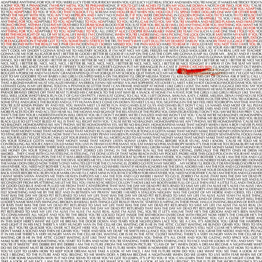
XTC - GO 2

Did Explosions in the Sky know about this Alice Cooper cover? I'm not sure. The cover is about the best thing you can find about this obscure 80s Cooper album, recorded in the depths of his drug addiction (he has stated in interviews he has no recollection of recording it, or the albums immediately before and after). The all-over-text album cover is also nothing new, with Hipgnosis' cover for the first XTC album being the earliest one I can recall. With so many albums having sexy cover images, it's refreshing to come across one that asks the viewer to take a minute to read it. EITS seems like the scribblings of someone stranded in a post-apocalyptic landscape, frantically trying to remind themselves that there must be someone out there. Cooper's seems like an art director at the label was given free reign to do whatever, and the XTC cover was Hipgnosis' smartass reaction to the expensive, photo-heavy covers they were usually tasked with creating.
Bee Gees - Odessa

You need to see this cover in person to get the full effect: The type is of course gorgeous, but the red is a fuzzy sort of fabric that has this beautiful tactile contrast to the shiny lettering. If you're unaware, before Saturday Night Fever the Bee Gees flirting with everything from psychedelic pop to this folky concept album about a sinking ship. The front almost looks like a funeral program, which is fitting as the gatefold is a painting of the ship mid-sinking, with a small child being thrown to a lifeboat on a stormy sea. The band thought this was their Big, Important Album, and needed an iconic cover to go with it. It seems almost perverse to have a type-only cover on such a densely orchestrated album, specifically written to be their answer to Sgt. Peppers.
Aphrodite's Child – 666
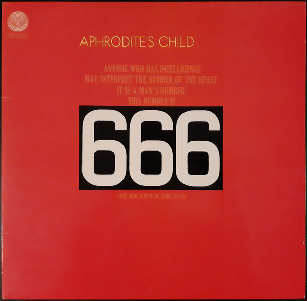
For years I was unaware that the lettering of the title was designed to look like European license plates. That's just incredibly weird to do, plus having it re-appear on a car in the liner notes. The album is another concept piece wherein a stage play about the Apocalypse is performed in a circus tent while the actual Apocalypse is raging outside. Then the liner notes shows a car with a 666 license plate careening off a road. What?? Why?? I love how it makes zero sense. Covers like this make me think "this has got to be important if they decided to not put a sexy photo on the front." The cover kind of looks like a playbill too.
Black Sabbath – Master of Reality


Simplicity is the key to longevity, I think, and if copying is the highest compliment you can give a piece of art, Master of Reality may be the best album cover ever. At least the best metal album cover. The weird billowing letters presented slightly askew, the purple and black, its like the giant fuzzy slab of metal inside was transformed into a typeface. Can lettering be a lumbering beast? This one certainly is. It's got that old Universal Horror vibe without being beholden to a single era.
The Belbury Poly – New Ways Out

Julien House's label Ghost Box always has amazing art, but I singled this one out because it has a cool 3D sort of effect. There's been photographs on Ghost Box covers before, but this is the first I've seen where the typography is given a sort of photographic effect, in this case the RGB cells in old CRT televisions. I love their whole Hauntology vibe, reminds me of the old PBS educational shows I watched as a kid.
Ricardo Villalobos – Thé Au Harem D'Archimède
Muscles – Guns Babes Lemonade

The shiny digital letters is a good indicator of the hyper-compressed poppy bedroom House music inside. The letters are slightly beveled with a metallic sheen, solid like the kick drums, but the top is bright and fizzy like hi hats and synthesizers. I gotta respect sticking with type-only when most of the songs are about sex and getting fucked up.
Aerosmith – Greatest Hits

This one is so close to looking like a budget bin compilation, but I have a soft spot for it. It was one of the stack of free CDs my parents got with their first CD player in the late 80s. Aerosmith's logo is so iconic, the lettering seems like a melding of 50's car culture and 60 psychedelia, and it's presented so large it won't even fit on the cover! Pre-comeback, this album graced nearly ever album collection in America. 12 million copies sold! The band is legendary for its excess, so it's funny that such a bold, simple cover became their best known. It doesn't hurt that it's got an almost impeccable track listing (we will not be discussing the last 2 songs).